
Introduction: Does Layout Really Change How People Read?
Learn how to use F-Pattern Web Design to structure your blog content for maximum readability and SEO performance. Discover why aligning your headlines, visuals, and CTAs with natural eye movement keeps readers engaged and improves ranking results.
Have you ever wondered why some web pages instantly grab your attention — while others feel tiring to read?
That’s where F-Pattern Web Design comes in.
F-Pattern web design shows how people naturally read online content. Imagine opening two websites with the same information—one feels easy to follow, while the other feels confusing.
Let’s compare two short examples 👇
❌ Without the F-Pattern
Welcome to our web design service. We create websites for businesses of all sizes. Our team focuses on quality, speed, and creativity. Contact us for more details.
✅ With the F-Pattern
Web Design That Works.
Fast. Creative. SEO-Friendly.
→ Trusted by 100+ Vancouver businesses.
Let’s build yours today.
Result:
The second example instantly grabs attention — the headline is strong (top-left),
the important points are front-loaded, and the CTA (bottom-right) appears naturally.
This structure matches how people actually read online: following an “F” shaped pattern.
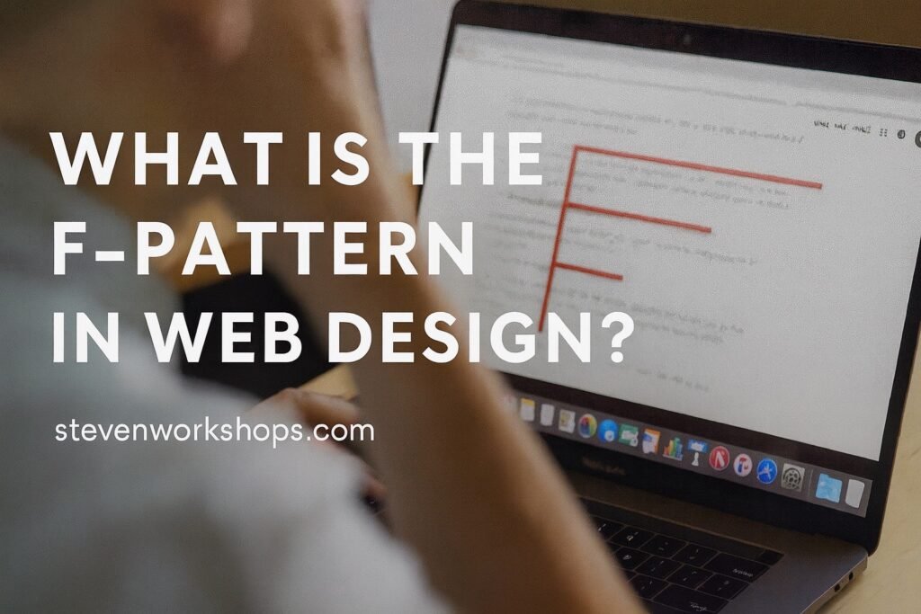
What Is the F-Pattern in Web Design?
The F-pattern is a reading behavior discovered by the Nielsen Norman Group through eye-tracking research.
It shows that when users land on a webpage, their eyes typically move in the shape of the letter “F.”
- They start by reading the top line (usually the headline).
- Then, they move horizontally to the right, scanning key subheadings.
- Finally, their eyes move vertically down the left side, occasionally glancing across shorter lines.
This pattern explains why visitors often don’t read word-for-word — they scan for relevance.
In short:
People read websites like they’re shopping, not like they’re studying.
Design should help them find what matters fast.
When designing for online readers, F-Pattern Web Design helps organize information in a way that matches natural eye movements. By placing key elements such as headlines, visuals, and CTAs along the “F” shape, users engage more effectively with your content. Many UX specialists emphasize that F-Pattern Web Design improves both readability and conversion, especially in blogs and long-form articles.
For example, F-Pattern Web Design can guide users toward the most important information without overwhelming them, creating a more balanced and user-friendly layout.
Why F-Pattern Web Design Improves UX and Boosts SEO Rankings
1. Improves Readability
Breaking long paragraphs into short lines, bullets, and subheadings allows users to scan quickly — reducing bounce rate.
2. Increases Engagement
If visitors can find key information fast, they stay longer and interact more — improving dwell time (a positive SEO signal).
3. Boosts Conversion Rate
By aligning CTAs (like “Book Now” or “Get Free Analysis”) with the natural eye flow, you make actions feel easy and obvious.
: How to Apply the F-Pattern to Your Web Pages
Step 1 – Start Strong (Top-Left Focus)
Place your main headline (H1) and primary keyword at the top-left.
This is where users look first — make it meaningful.
Example: “Website Redesign in Vancouver – Modern, Fast, SEO-Ready”
✅ Includes the main keyword (website redesign in Vancouver) for SEO
✅ Instantly communicates service + benefit
Step 2 – Use Short, Scannable Lines
Readers lose focus on long paragraphs.
Use short lines, subheadings (H2/H3), and visual breaks like images or icons.
“Modern design.”
“7-day delivery.”
“Fixed pricing.”
These short statements create a horizontal scanning effect — the top bar of the “F.”
Step 3 – Guide Downward with Visual Hierarchy
Use contrast, whitespace, and alignment to lead the eye downward.
On the left side, use bullet points, short sentences, or icons.
On the right, place your main CTA or form button.
CTA example: “Get Free Website Analysis” (Bright button, bottom-right)
Step 4 – Keep SEO in Mind
Use your keywords naturally within these visual structures:
Section Example Keyword Placement Example H1 website redesign vancouver “Website Redesign in Vancouver” H2 F pattern web design “How to Use the F-Pattern in Web Design” Body UX design tips Mention once naturally in intro and body CTA free website analysis “Get your free website analysis today”
F-Pattern vs. Z-Pattern
Both patterns describe user eye movement — but for different situations:
| Pattern | Best for | Description |
|---|---|---|
| F-Pattern | Text-heavy pages (blogs, service pages) | Readers scan top-left to bottom-left, forming an F shape |
| Z-Pattern | Simple pages (ads, hero sections) | Readers follow a Z path: top-left → top-right → bottom-left → bottom-right |
For blogs or portfolios, use the F-pattern.
For landing pages with few elements, try the Z-pattern.
Real Example – F-Pattern in Action
A Vancouver-based marketing site used to start with a long paragraph:
“We build websites for local businesses and help them grow online…”
After redesigning with an F-pattern, the new layout started with:
“Modern Websites for Vancouver Businesses.”
“Launch in 7 Days.”
“Fixed Pricing. Free SEO Setup.”
[Get Free Quote]
Result:
- Bounce rate dropped by 26%
- Average time on page increased by 38%
- Form submissions nearly doubled
According to the Nielsen Norman Group, users tend to scan websites in an “F” shape pattern—reading the top line first, then moving down the left side of the page. This research proves why F-Pattern Web Design is effective for blogs and marketing websites.According to Chartbeat, 55% of visitors spend less than 15 seconds on a page — proving that scan-friendly layouts like the F-pattern are crucial for keeping attention.
Additionally, tools like Mailchimp’s Content Marketing Guide also highlight how visual hierarchy and readability improve engagement and SEO performance.
Conclusion – Design for How People Really Read
The F-pattern reminds us that good design starts with understanding behavior.
When you organize your page like the way people naturally scan,
your message becomes clearer, faster, and more persuasive.
So next time you write a blog, service page, or portfolio,
remember to sketch the letter “F” before you start —
and let your design guide the reader’s eyes exactly where you want them to go.
You can also learn more about my process and brand philosophy on the About Page.